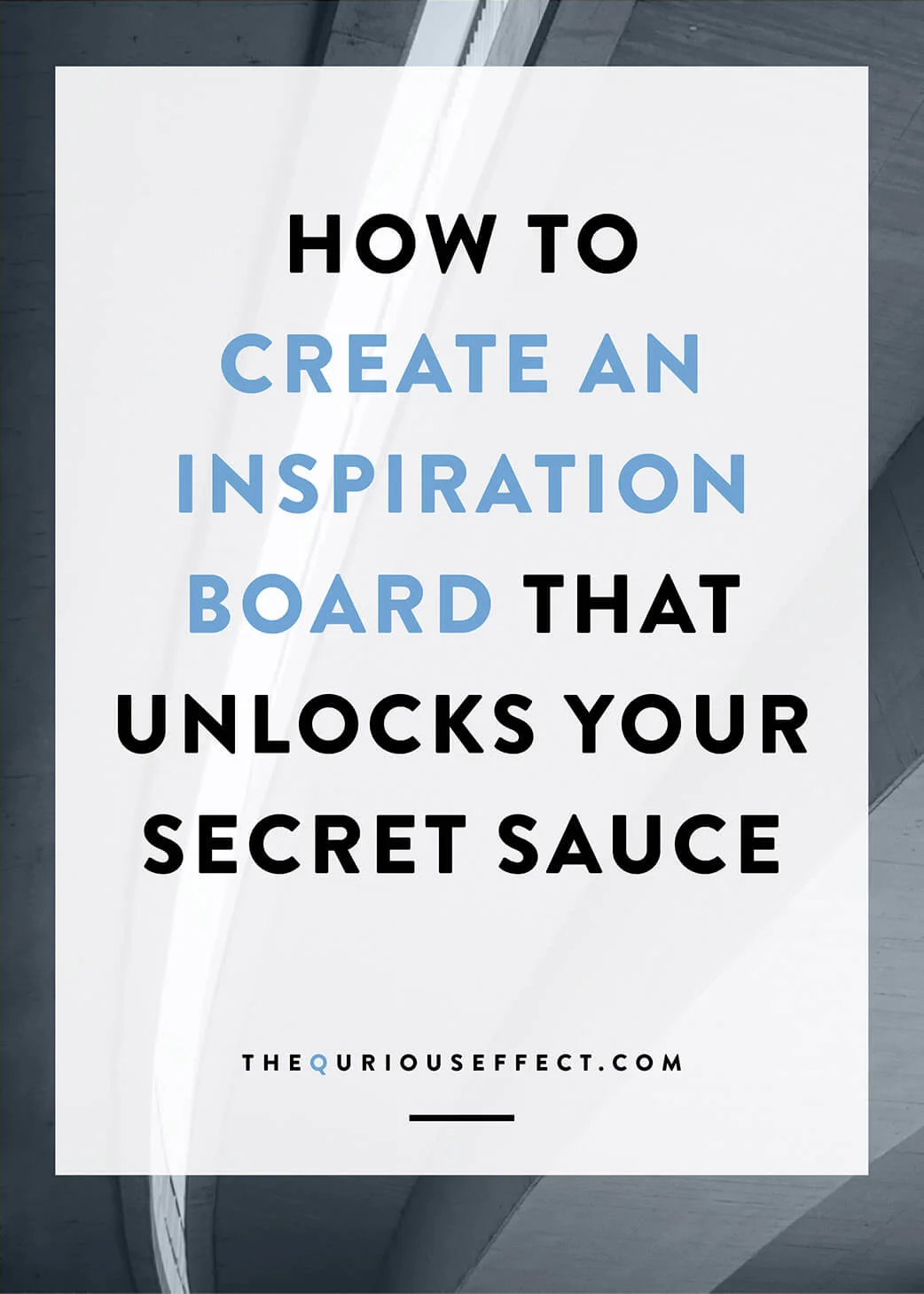
How to Create an Inspiration Board that Unlocks your Secret Sauce
and why it's important ...
In my last post, I talked about my brand identity client homework process and specifically why the questionnaire is so important to developing a powerfully authentic brand that completely captures your business and and attracts your ideal clients.
Towards the end of the post, I briefly mentioned the inspiration board part of my client homework because I believe it deserves an in-depth review all on it’s own. So you can see for yourself just how powerful an inspiration board can be.
A quick Google or Pinterest search will reveal lots of information on this topic, not only as it applies to brand identity design but also in relation to weddings, interior design, envisioning your future, photography and just about anything else you can think of.
I love how an inspiration board can be so versatile and can benefit so many different types of projects. Since I’m a brand identity designer, I’ll focus on how I use it with my clients.
Inspiration Board as Client Homework
It’s kind of like the reward for making it through answering all the tough brand development questions. We switch from using words to describe your business to images. I have my clients set up a secret Pinterest board and share it with me.
On the Pinterest board, I ask them to pin anything and everything they feel drawn to that represents their business. The goal is to pin around 50 items to the board. Don’t worry if you can’t make it all the way to 50; aim for at least 25. The pins can include any subject matter and from them I’m looking to pull inspiration for typography, logo design, colors, textures, patterns, personality, tone and feel.
Here are a few ideas for Pinterest searches to get your inspiration going:
Packaging
Interior Design
Fashion
Book Covers
Favorite stores/brands
Style bloggers with gorgeous Pinterest boards like SFGirlByBay/Victoria Smith or Camille Styles
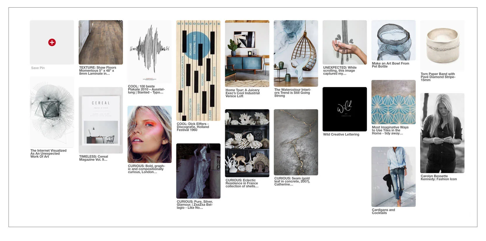
This is an example of my business’s Pinterest inspiration board. Every time I look at it, it makes me happy.
For me, I feel the inspiration board is just as important – if not more important – as the written questionnaire because it allows my clients to speak to me in a way that they may not be able to with words. The phrase, “I’ll know it when I see it” comes into play here.
As my client, I don’t expect you to know the ins and outs of graphic design and you’re hiring me so you don’t have to.
So while you may find answering the homework questions somewhat challenging, you can probably search around Pinterest and easily be inspired by what you find there. In fact, you might have so much fun with this part of your homework that you find you have way more than 50 pins on your board.
INSPIRATION BOARD EXAMPLES
When answering the homework questions you may determine that your business’s personality is modern and sophisticated. Those are great descriptive words but there are many different color palettes and design directions that could fall within that description.
The visual inspiration board allows me to see in more detail what you mean by modern and sophisticated.
Let’s take a look at a couple visual examples.

[photo credits here, here & here]
In the example above, the images are predominantly black and white with an accent color of gold. I would classify this as a sophisticated, modern neutral palette.
There’s a good amount of white space within the images and the text shown uses mainly san-serif fonts. Lots of white space leans a little more modern while the san serif typefaces trend more classical.
The large, beautiful ampersand graphic on the pillow is also indicative of a modern sophisticated feel. Also appearing are a striped, geometric pattern and a more organic circular splatter pattern. Organic patterns tend to be a nice, soft contrast to bold geometrics. These three images have a bold, stylish simplicity to them. Truly elegant with a good balance between modern and sophisticated.
Let’s sum up what we’ve learned from these three images:
Modern neutral palette: black, white & gold
White space
Serif fonts
Bold geometric graphics mixed with a dash of the organic to soften things up a bit
Bold, stylish simplicity
Elegant with a good balance between modern and sophisticated
[photo credits here, here & here]
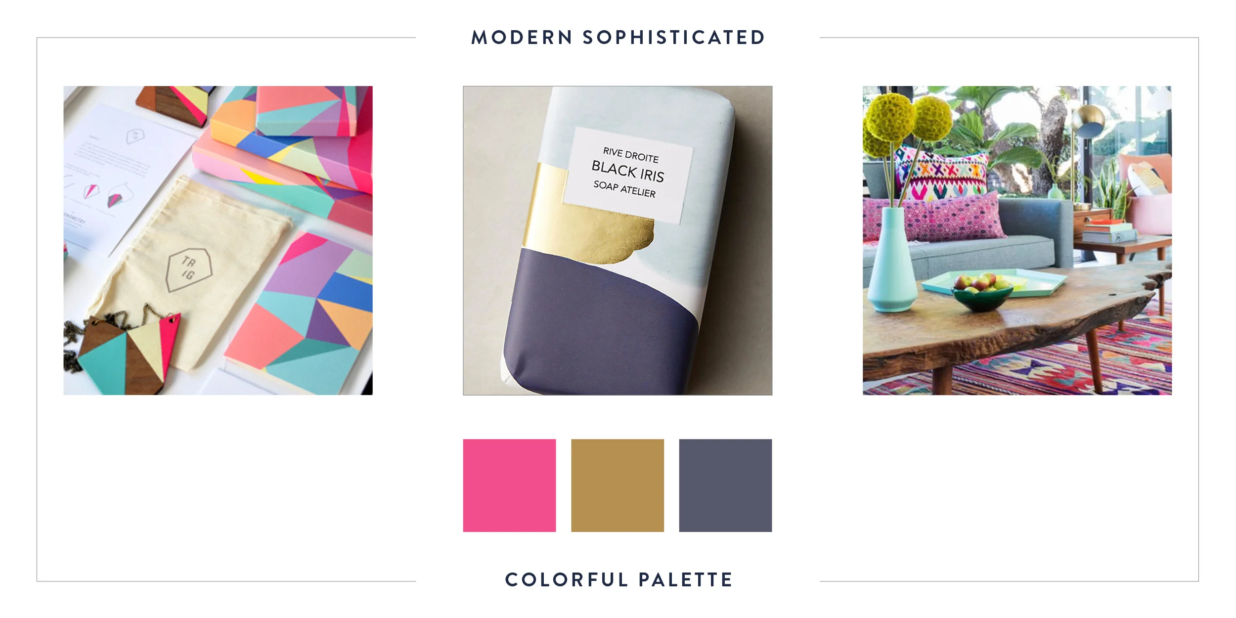
The second modern and sophisticated palette looks pretty different from the first example, right?! But it definitely has a modern sophisticated look too. With the inclusion of the bright, bold colors, I’d say this is a sophisticated, modern, colorful palette.
There are lots of colors as well as warmth brought in through the wood and plants that can be seen. A similarity between this board and the first is the inclusion of gold. But the gold here feels pretty different from the first example.
The layering of color and pattern combined with the natural wood and plant elements creates a very warm, inviting, organic feel. There are soft edges as well as hard geometric ones.
The blending of all the elements in this example feels warm and inviting. Everything is well designed and that lends the sophisticated element. Nothing feels overdone or over the top even though there is a lot going on. This also speaks to a sophistication and knowing when enough is enough.
The fonts shown are san serif in all caps which are very modern and sophisticated. With the bold, layered elements a san serif font makes sense here, it’s a clean simple contrast to the busyness of everything else going on.
The gist of what’s going on in these images:
Modern colorful palette: Warm bright pinks, cooler purple tones & gold
Layered textural elements
Patterns
San serif fonts
More organic shapes with a few hard edges
Bold, layered style
Warm and inviting, leaning more towards modern
As a client you may not be able to say all these things within your questionnaire but there’s a good chance you’ll know them when you see them. And it’s my job as a designer to translate what my clients show me into a unique, powerful and authentic brand that they love and is irresistible to their clients.
THE SECRET SAUCE
From a client’s Pinterest inspiration board and the answers to their brand identity questionnaire, I narrow the pins down to a dozen or so that I feel really represent the brand’s identity.
This condensed version of the inspiration board gets sent to my client on the first day of their project so they can review it and see how it feels. They have the opportunity to make one revision, ensuring it’s just right.
And once it’s just right, we’ve got the secret sauce!
At this point, we have answers to all the tough, defining questions about your business and what sets it apart from everyone else. And we’ve got visual proof and support to help us narrow in on the design. No one else will answer the questions or pick the same images as you. So these assignments really do create a comprehensive unique view of your business.
Once approved, it becomes the visual standard for the rest of the design process. And then we’re off, starting in on the logo design.
YOU MIGHT LIKE TO READ


SO WHAT DO YOU THINK?
What did you get from the sample inspiration board images? Let me know in the comments below.
Are you ready to work with a pro? If you’re interested in learning more about working with me, check out my services page.