Aspen Words
Long-term creative partnership · Editorial and institutional design
Designing for continuity across seasons, programs, and audiences
Aspen Words is a mission-driven literary organization dedicated to encouraging writers, inspiring readers, and connecting people through the power of stories. Over more than a decade, I’ve partnered with their team to design a wide range of materials supporting seasonal programs, signature events, and institutional moments.
The challenge isn’t creating a single standout piece — it’s developing work that evolves year after year while remaining recognizable, flexible, and aligned with the organization’s values.
The work
My work with Aspen Words spans multiple programs and formats, designed to function both independently and as part of a larger, evolving system.
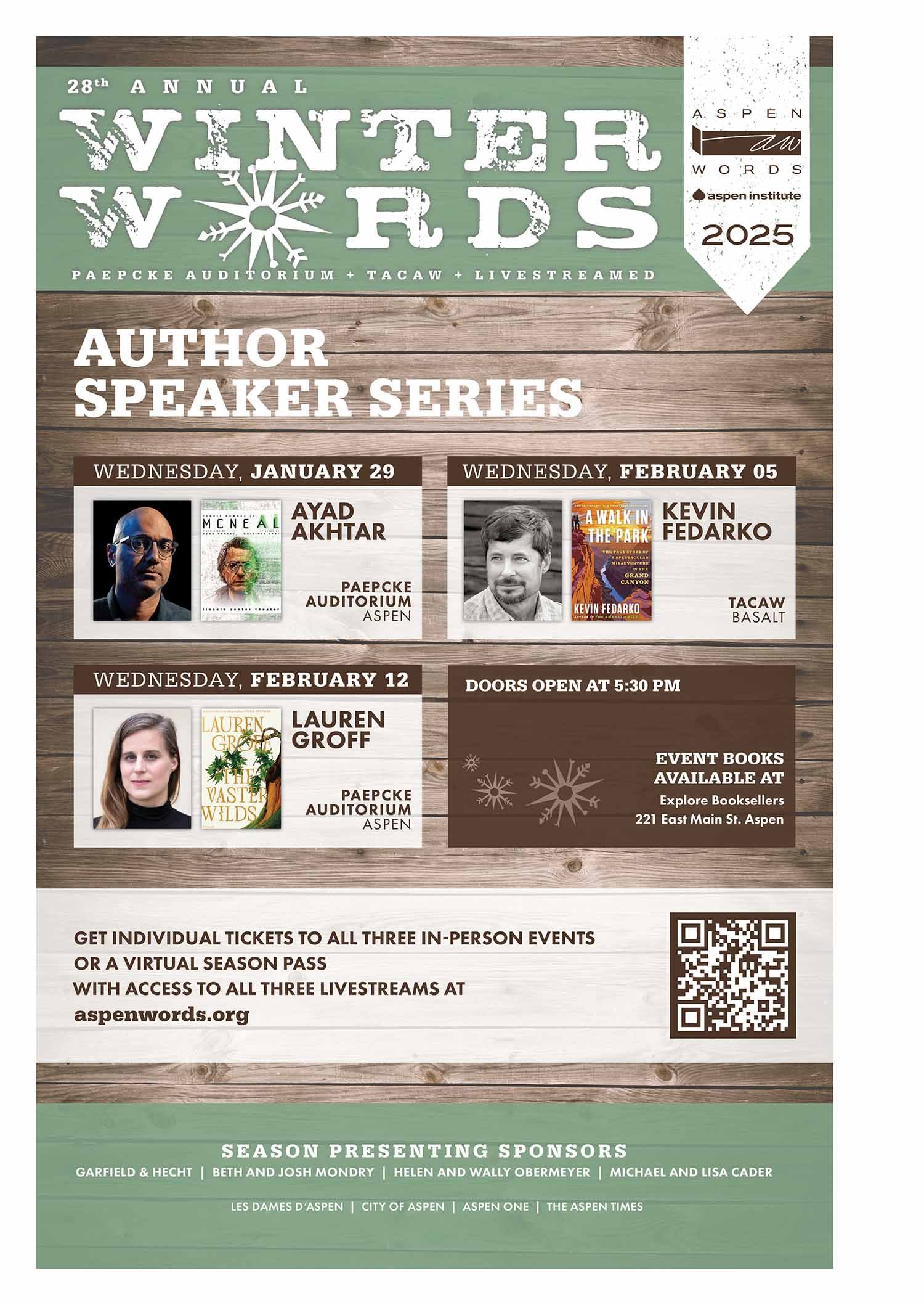
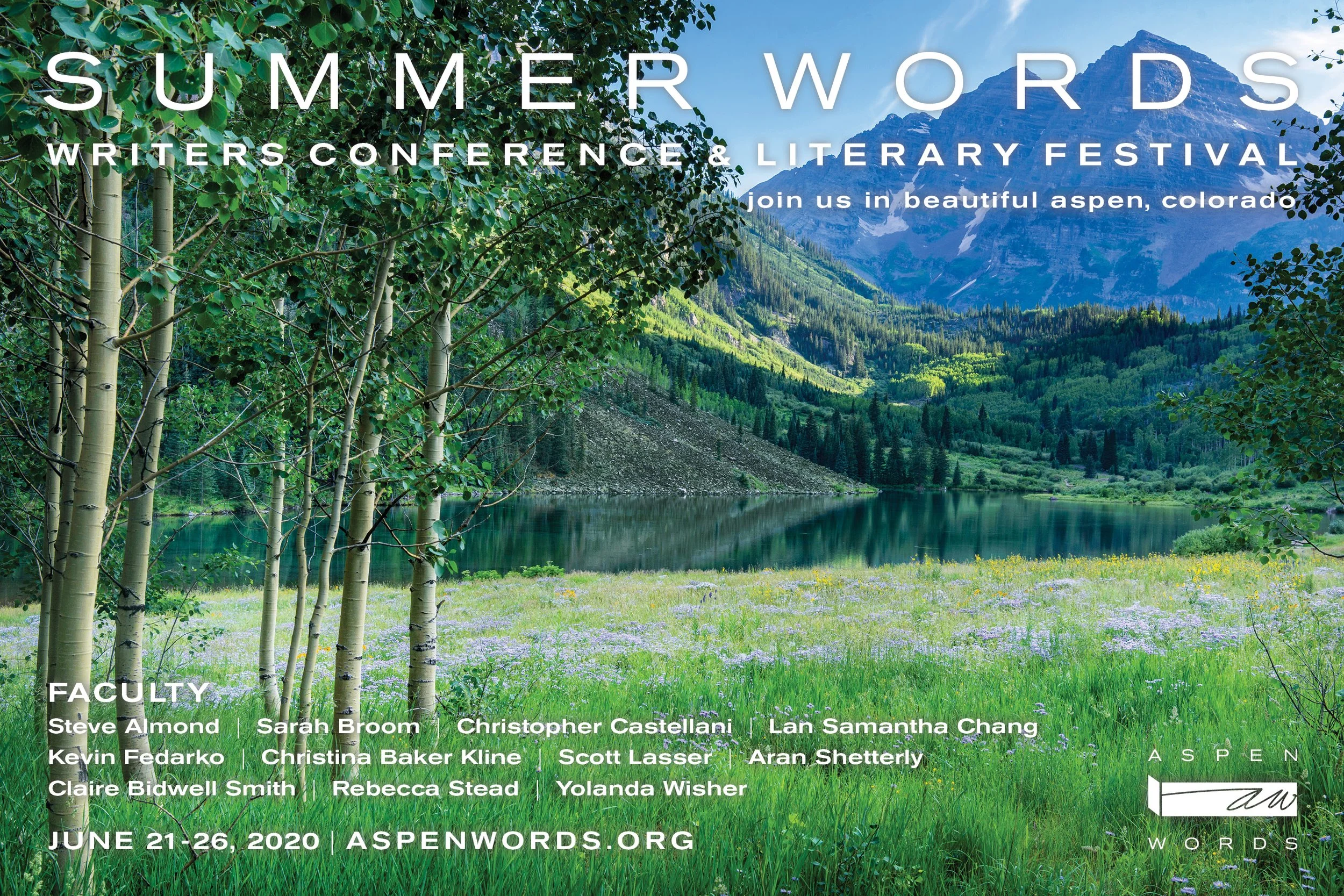
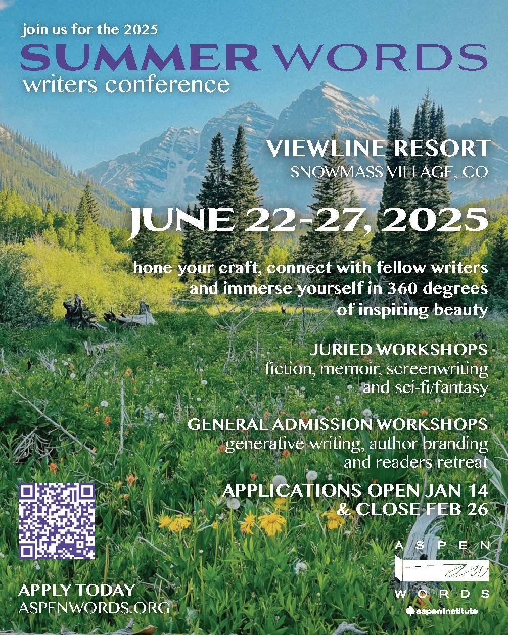
Seasonal event systems for Winter Words and Summer Words
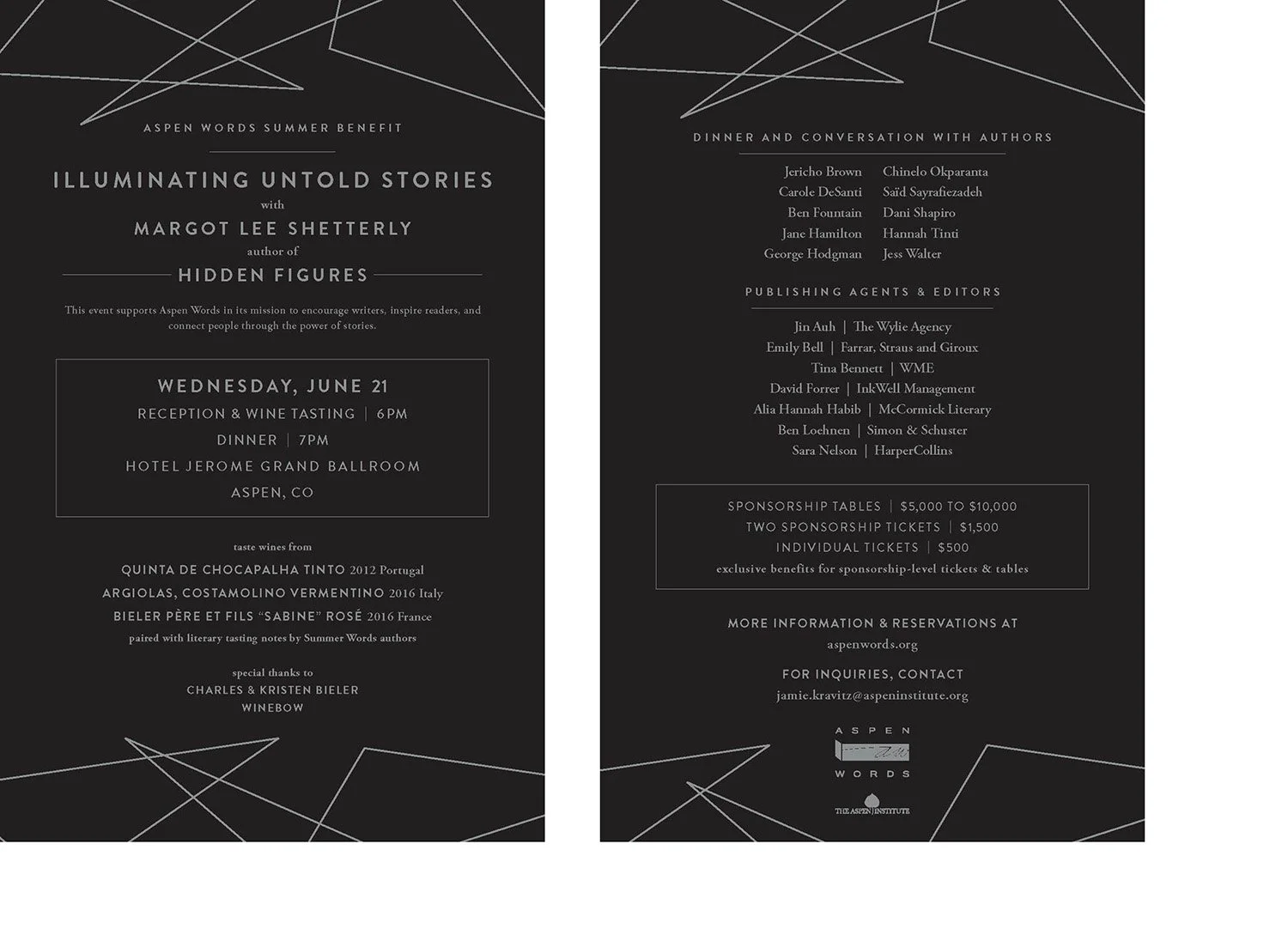
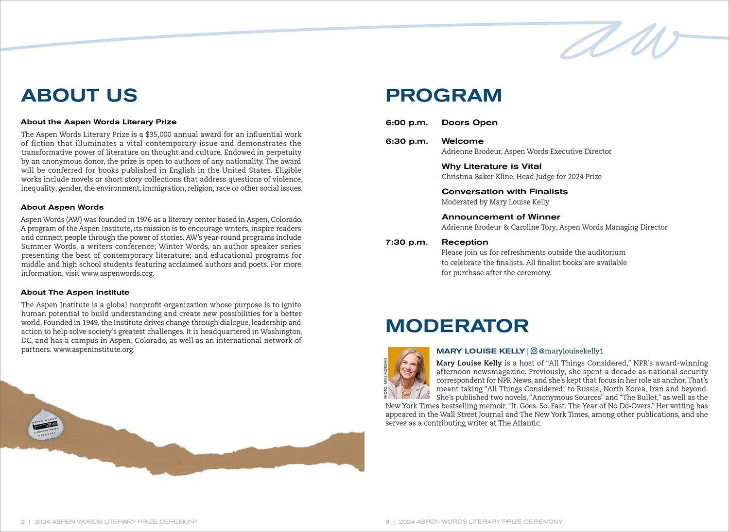
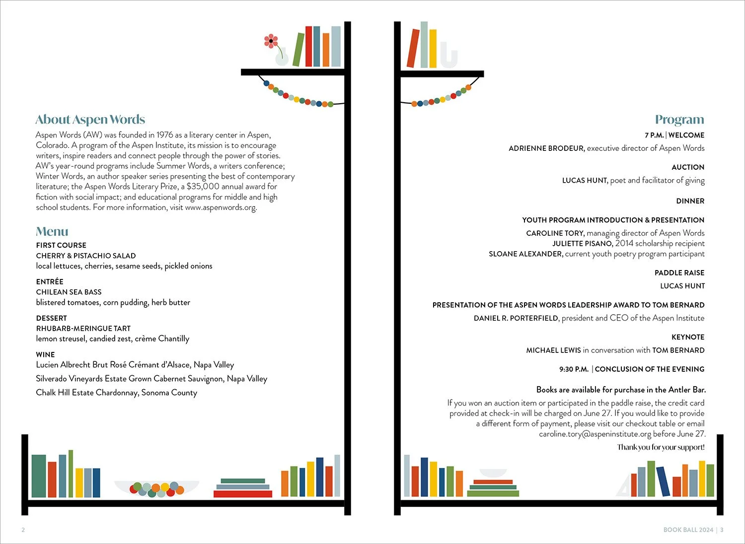
Signature event materials for the Summer Gala, Book Ball and Aspen Words Literary Prize
Ongoing promotional and organizational materials across print and digital
Each project needs to feel cohesive within the larger Aspen Words identity, while still allowing space for variation, freshness, and program-specific storytelling.
Consistency comes not from repetition, but from thoughtful interpretation and careful decision-making.
The approach
Rather than reinventing the brand with each initiative, the work focuses on interpretation and continuity.
I work within Aspen Words’ existing visual language — typography, tone, and editorial sensibility — while refining how those elements show up across different contexts.
Some programs call for expressive, illustrative moments; others require restraint and clarity. The goal is always the same: to support the story without overpowering it.
As programs evolve, so do the materials. Formats shift, scope changes, and priorities adjust year to year — and the design adapts accordingly.
As the organization’s needs evolve, the design systems adapt without losing coherence.
The result
The outcome is a body of work that feels intentional rather than templated — familiar without becoming stale.
By building flexible systems and designing with longevity in mind, Aspen Words has been able to carry a clear visual identity across seasons and programs while allowing each initiative to feel distinct.
The work supports internal teams, engages audiences, and reflects the organization’s deep respect for craft, language, and storytelling.
Most importantly, the process makes it easier for the Aspen Words team to move forward year after year — without re-solving the same design questions each time.
A note on partnership
This work reflects a long-term creative relationship built on trust, listening, and shared understanding. Over time, ideas translate more quickly, decisions feel clearer, and the work moves forward with ease — a rhythm that allows the design to grow alongside the organization.