
Brand Identity & Squarespace website for Presto Denver
Today I'm sharing with you a fun project I recently wrapped up. A brand and Squarespace website design project for Presto Denver. A professional, efficient concierge service that serves as an extra pair of hands for their clients in order to make mundane tasks and errands disappear.
Let’s take a look!
Since Presto Denver aims to serve a wide community in the Denver metro area, it was important to keep their branding and site friendly, personable and approachable in order to convey how easy it is to work with them.
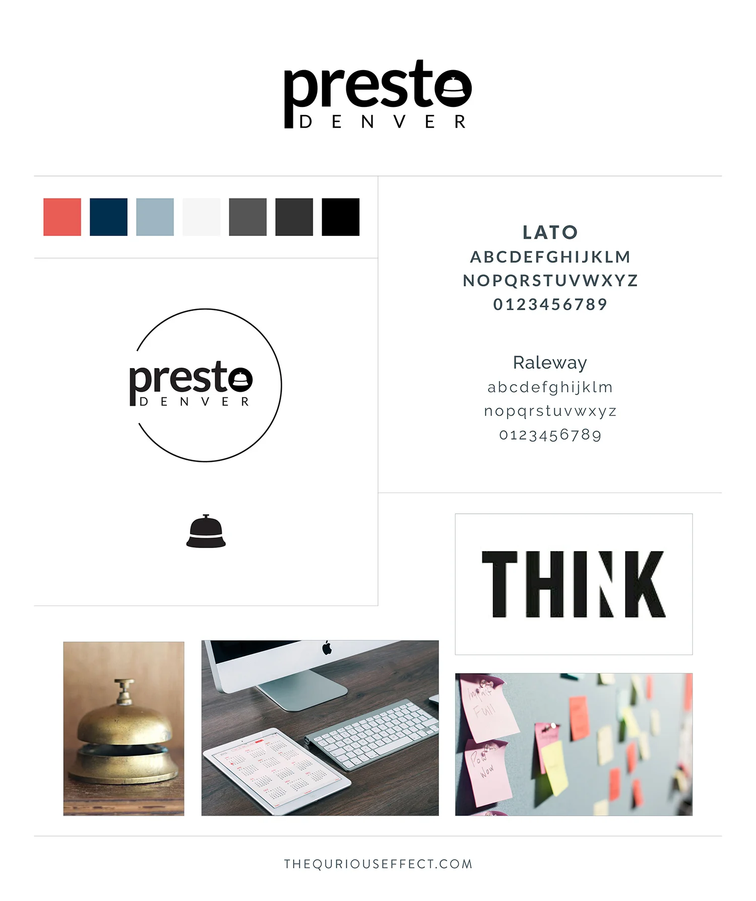
Adjectives that describe Presto Denver's look are: minimal, fresh, clean, orderly, modern and classic – just like the hotel bell used as their brand mark.
Logotype Concepts

Concept 1 & 2 | concierge bell "o" uppercase & Lowercase
The hotel concierge bell is a familiar and classic image to visually communicate the services offered by Presto Denver. It brings to mind thoughts of efficiency, professionalism, high-quality service, organization and it has been executed in a modern, minimal, clean fashion – nicely representing the brand’s look. Concept 1 is a bit more modern while Concept 2's lowercase letters read as more personable, casual and friendly.
Concept 3 | exclamation point
The feel here is friendly, approachable and professional. Using the exclamation point in this manner is modern and a simple way to express impact. Visually this concept communicates that hiring Presto Denver is simple and easy.
Ultimately a combination of Concept 2 and 3 was selected as the final logo.
Secondary Logotype & Mark
Once the logo was selected and finalized, I moved on to creating the logotype variation and mark. Since Presto Denver’s business is all about making life easier for their clients, we played off the idea of an "easy button" circle for their secondary logo. And with the hotel bell illustration being the mark within the logotype, it made total sense to use it on it's own as the mark and website favicon.

To bring the whole brand identity together, I created the brand style guide. It brings all the elements together in one place for future reference anytime an additional design related item needs to be created. My clients often comment on how profound it feels to see all the elements come together in the style guide.
Squarespace Website Design
That last piece of the project was a Squarespace website. As with the branding we kept the site friendly and easy to use with great photographs that visually represent the services Presto offers their clients. The minimal, fresh and modern feel is enhanced by the use of the fonts Lato and Raleway. And their colors feel both classic and comfortable. Ultimately the design met all Presto Denver’s goals and will be easy to update as needed.
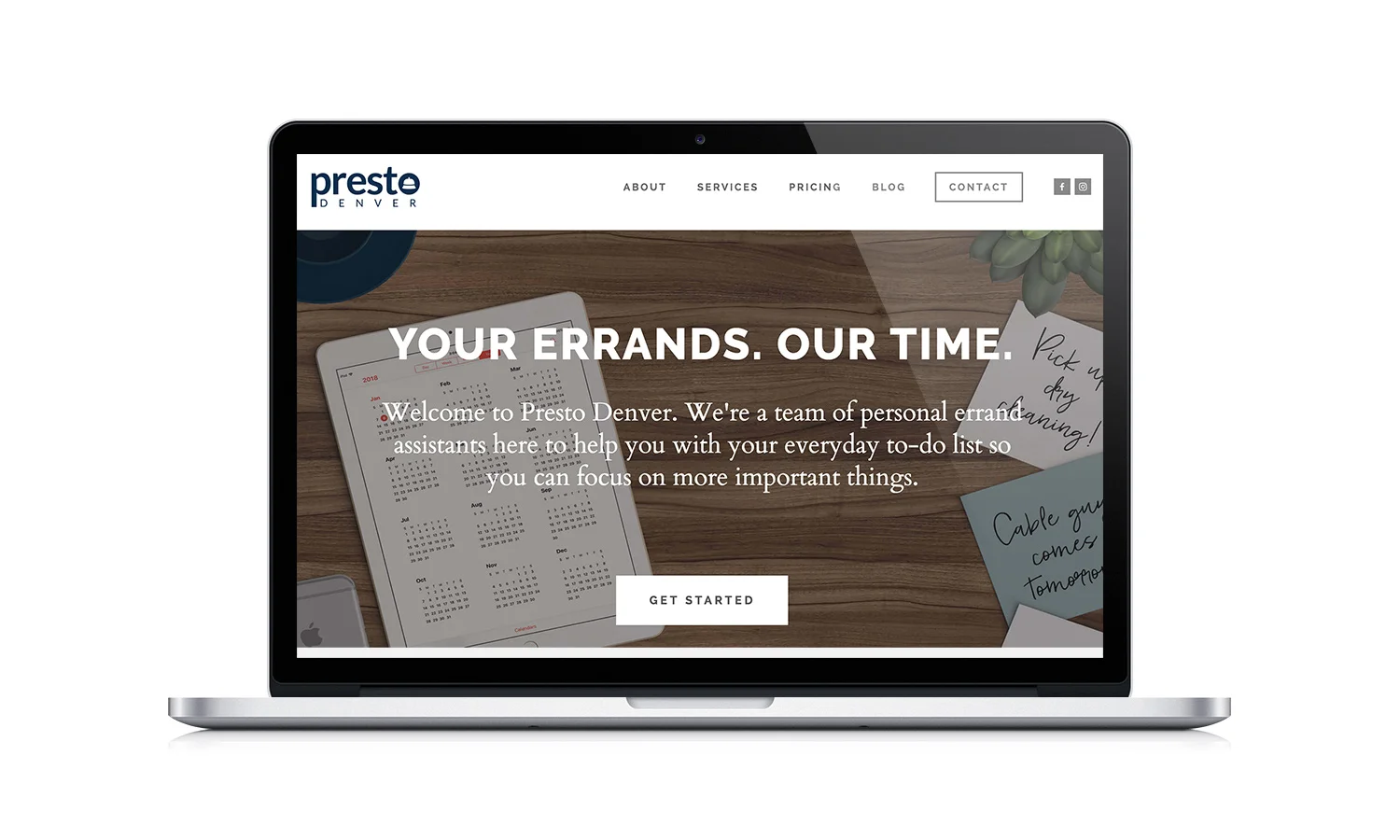
To check out Presto Denver's full website click the laptop image above!
I’m thrilled with how Presto's brand and Squarespace website turned out and had fun working with the powerhouse duo behind the business.