
Samuel Prudden
Brand identity · Squarespace website
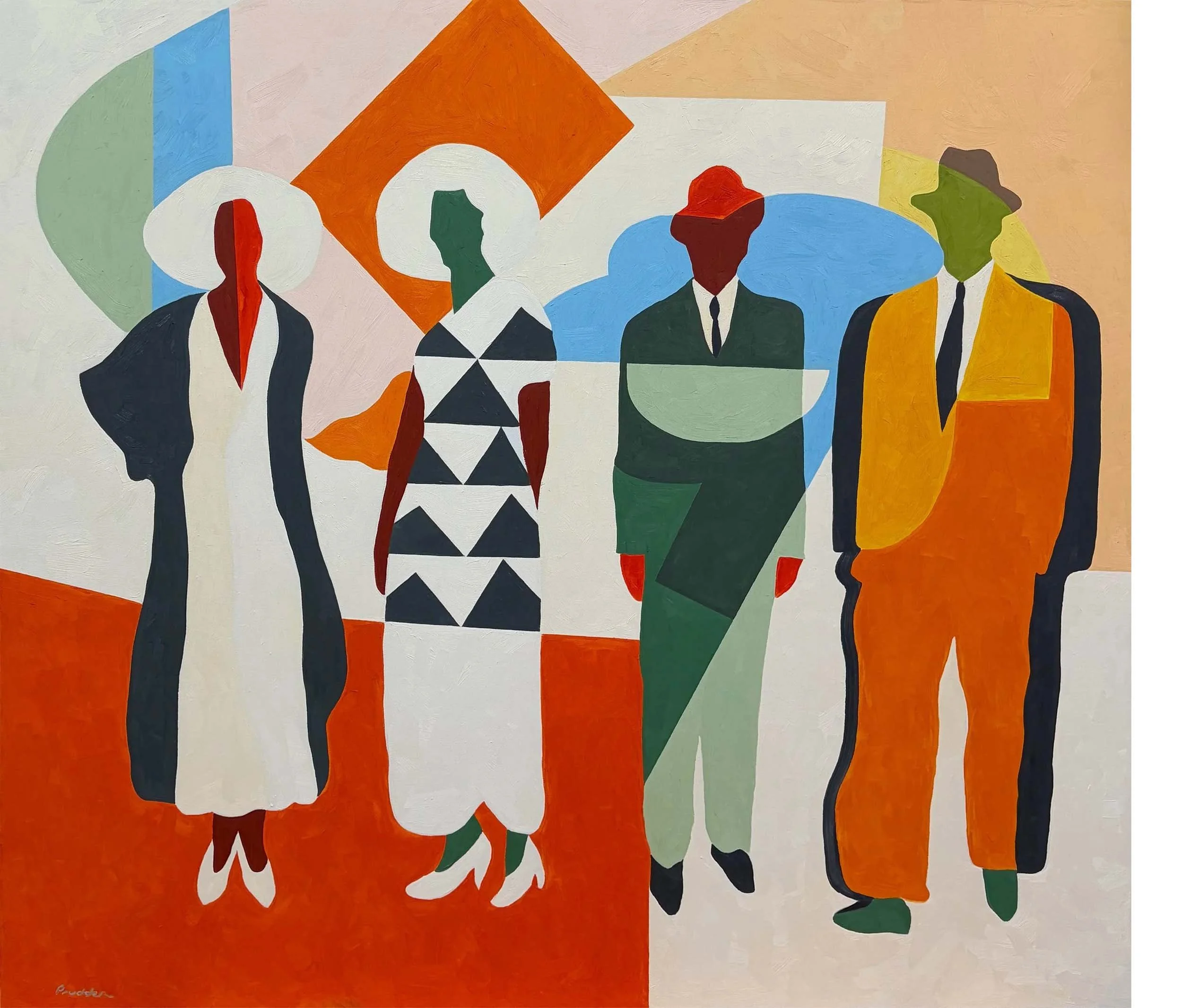
©SAMUEL PRUDDEN
Designing a visual identity that lets the work lead
Samuel Prudden is a neo-realist painter whose work is bold, restrained, and deeply evocative. As his career gained momentum, Samuel needed a brand identity and website that could support professional growth — attracting collectors and galleries — without distracting from the artwork itself.
The challenge was to create a visual presence that felt confident and timeless while allowing the art to remain the focal point.
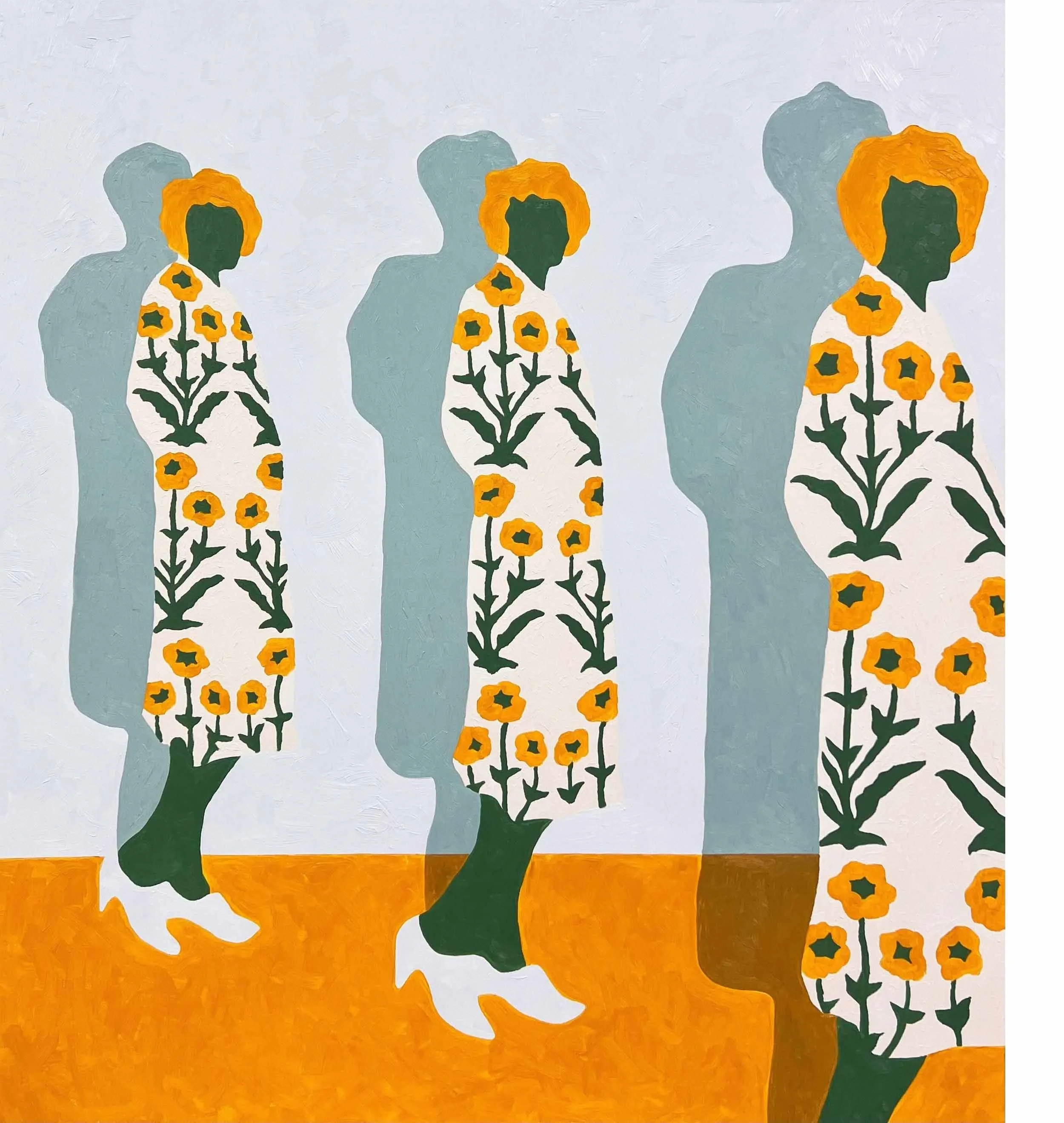
©SAMUEL PRUDDEN
My role
My role was to translate Samuel’s artistic sensibility into a visual foundation that could hold his work with clarity and respect.
Through close collaboration and thoughtful guidance, I led the branding and website process — helping define tone, typography, and structure so the identity felt aligned with Samuel’s work rather than imposed upon it.
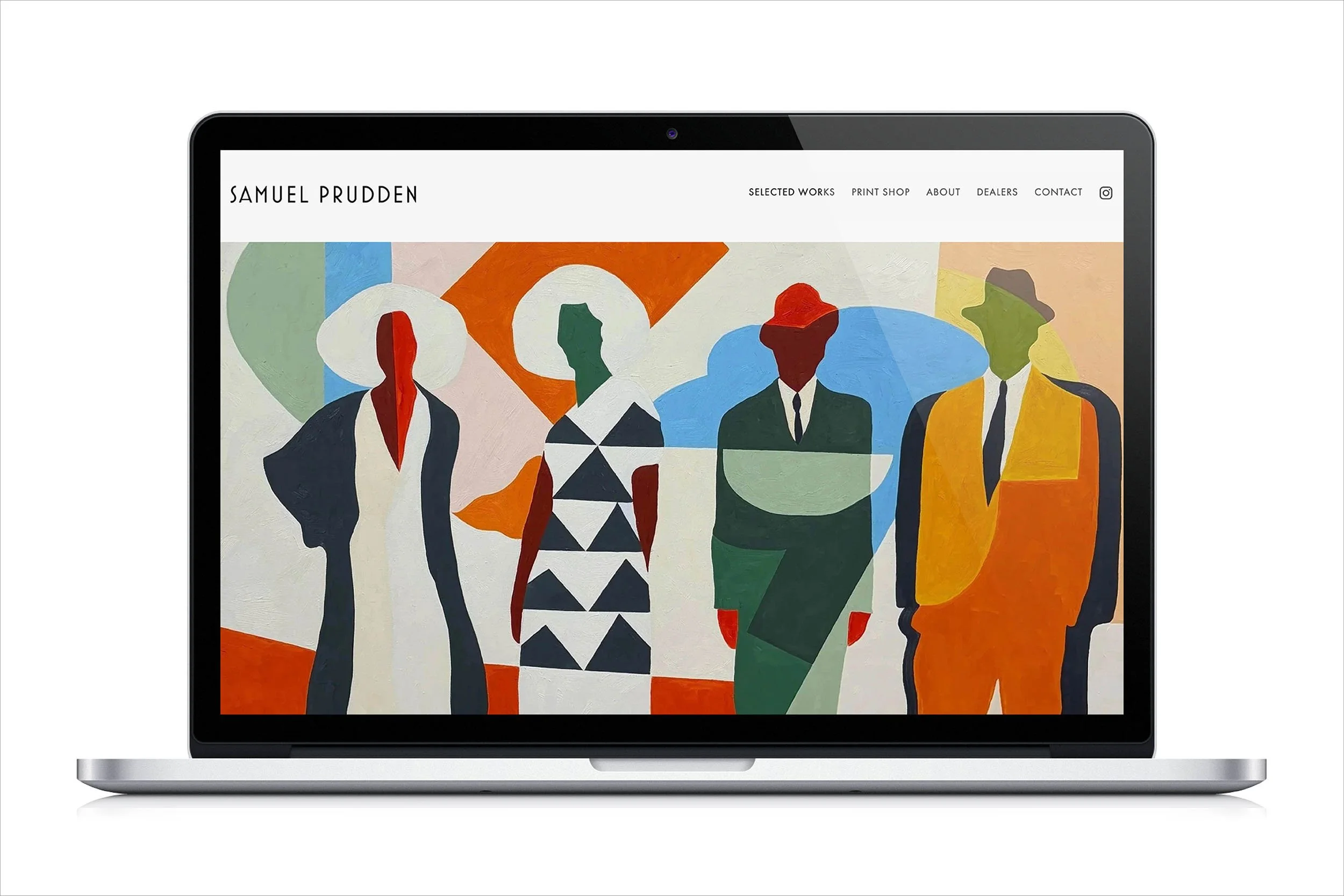
A visual identity that lets the work lead.
The approach
The design centered on restraint.
A subdued, monochromatic visual system was developed to support the artwork without competing with it. Typography choices subtly reflected early 20th-century influences — echoing Sam’s interest in nostalgia and timelessness — while maintaining a clean, modern sensibility.
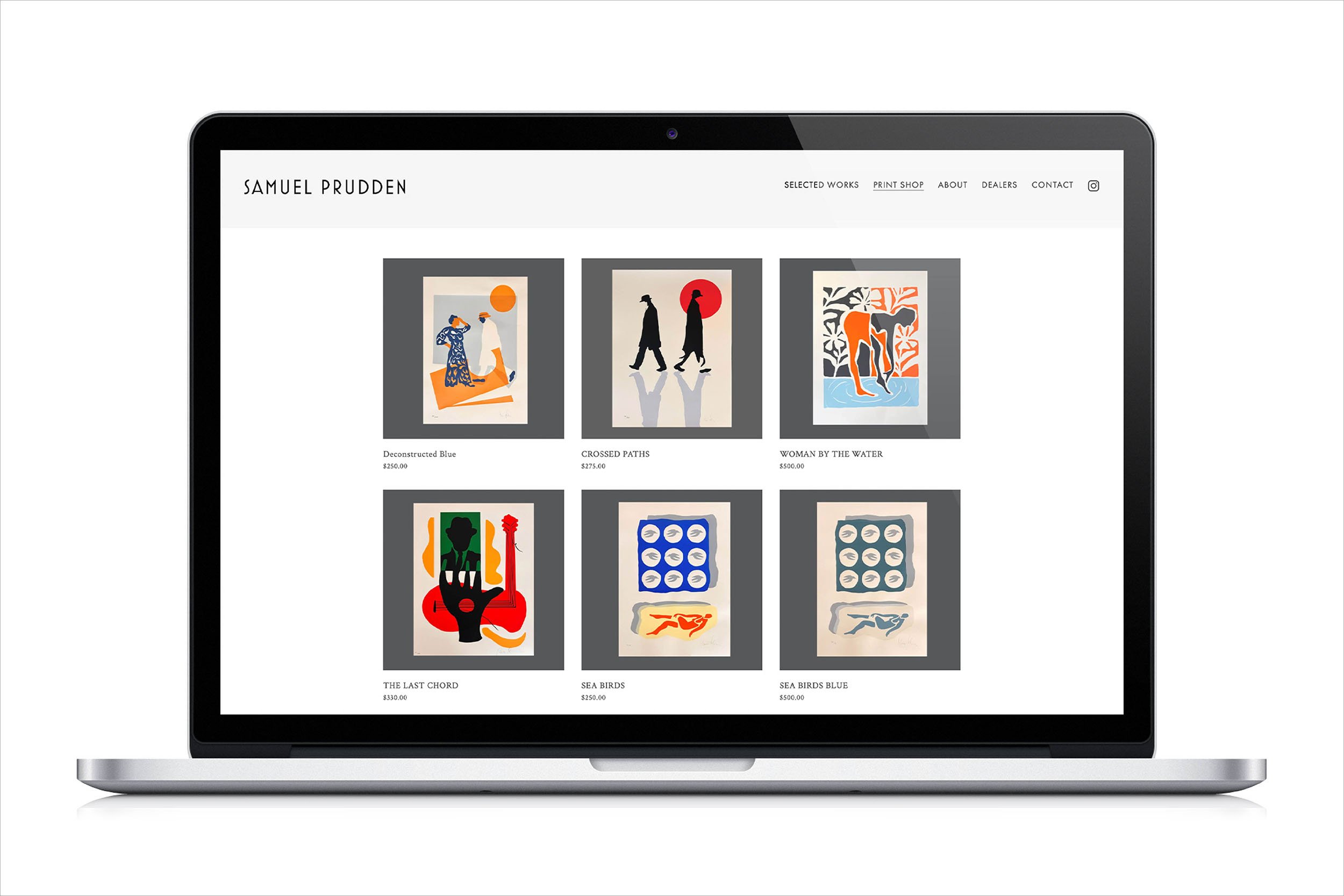
The Squarespace website was designed to be intuitive and flexible, allowing Sam to easily add new work over time while keeping the presentation consistent and polished.
The result
The finished brand and website feel confident, quiet, and intentional — creating space for the artwork to speak for itself.
With a clear visual foundation in place, Sam now has a professional presence that supports growth, invites engagement, and evolves easily as new work is introduced.