
Color: Spring 2017 Greenery + Kale

Each Spring and Fall, Pantone® releases a set of 10 “It” colors for the season. As Pantone® is pretty much color royalty, the colors make a big splash on the design scene, whether it be the season’s latest fashion trends, paint or logo colors.
Pantone® describes itself as a global authority on color and provider of professional color standards for the design industries. And I certainly can’t imagine life as a designer without them.
It’s likely you’re familiar with the season’s Pantone® colors even if you aren’t aware they exist.
Pantone® pulls the colors from each season’s New York Fashion Week. And once the season’s official colors are released, they quickly make their way through the design world and into mass production of fast fashion, photography styling and brand colors.
Often times while cruising through stock photography sites, I’ll be struck by a photo whose colors feel so spot on trend that I’ll save them for reference or use somehow later on.
So I thought it would be fun to try something new. A new series, based on color, where I curate photos that have struck me as perfect Pantone® color of the season examples.
To kick off the inaugural post, I’m focusing on the Spring 2017 greens, the lighter, brighter Greenery and it’s darker green companion Kale.
Here’s how Pantone® describes the colors:
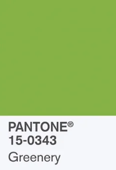
PANTONE 15-0343 Greenery
Bringing forth a refreshing take, Greenery is a tangy yellow-green that speaks to our need to explore, experiment and reinvent. Illustrative of flourishing foliage, the fertile attributes of Greenery signals one to take a deep breath, oxygenate and reinvigorate.
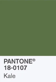
PANTONE 18-0107 Kale
Evocative of the great outdoors and a healthy lifestyle, Kale is another foliage-based green that conjures up our desire to connect to nature, similar to the more vivacious Greenery. And, just as we see in nature, this lush and fertile natural green shade provides the perfect complementary background to the more vibrant tones in the palette.

Aren't the photos lovely? Each one makes me happy to look at and guess what? They're all free stock images found from just one site! What site you might be asking ... well I'll tell you. They're all from Unsplash. You're welcome!
Besides just green color trends, can you spot any other trends within the photos?
Here are the official Pantone® Spring 2017 colors:

Photo: Pantone®
BONUS: In the past, it’s been difficult to find official CMYK and RGB color codes for the Pantone® picks. Now you can grab a copy of the official .ASE file right here. If you use the Adobe Creative suite, you’re in luck since .ASE palettes are for Adobe applications.
SO WHAT DO YOU THINK?
Are you a fan any of the colors in particular? Or is there one that you just can’t stand? Let me know in the comments below!
Are you ready to work with a pro? If you’re interested in learning more about working with me, check out my services page.